


 |
|
|
|
|
 |
|
|
|
|
|
|
|
|
| check this page for a very detailed list of WWW references to the subject, compiled by Aaron Marcus |
|
|
|
|
|
|
|
| The following annotated references are useful resources for further investigation of the issues addressed in the article. |
|
|
|
|
|
|
|
Too often, analyses of Websites have focused on technical issues of setting up and maintaining systems. Beyond these challenges lie the user interface design of the Website, the sum total of its controls and displays, which affect the appeal to user, but which also affect the userŐs ease of learning, ease of use, and productivity.
User interface research and development have given considerable attention to user interfaces for business productivity tools, training environments, and consumer products, on both applications and interactive documents or hypermedia search/retrieval environments. There are many valuable lessons for both neophytes and professionals to be learned by applying some of the insights gained in the user interface design community to Website design. The legacy and ongoing research undertaken in the user interface design community is extensive and easily available. Resources for information, user interface-oriented design organizations, and new technology sites on the Web plus a bibliography on the subject appear at the close of this article. This article introduces some key issues and provides examples of what can make the user interface design of a Website more successful. |
|
|
|
|
| What are User Interfaces? |
|
|
User interfaces are a mixture of functional and formal content. One definition of user interfaces is the physical display of informational, aesthetic, and persuasive content affording the means for interacting with that content. For the purposes of specific users and their tasks, user interfaces provide metaphors, mental models, navigation, appearance (including sound, for example), and interaction. These components may be defined in this way [Marcus, 1995]:
Metaphors: the essential terms, images, and concepts
Mental Model: the organization of data, functions, tasks, roles, and people
Navigation: the movement through the mental model afforded by menus, dialogue boxes, control panels, etc.
Appearance: the verbal, visual, and acoustic characteristics of the displays
Interaction: the means by which users input changes to the system and the feedback supplied by the system
Note that an application, its data, the graphical user interface (GUI), the hardware platform, the network, the input and output display devices, all contribute to the user interface. |
|
|
|
|
| The Beginning and the End of the Design Process |
|
|
User interface design is a process that begins with getting to know the target user community. The user interface design community has placed increasing importance on knowing as much about the user as possible: cognitive habits, educational and cultural background, perceived needs and desires, and the nature of jobs, roles, and tasks within an organization of work or play. Focus groups and usability tests have become valuable sources of information to determine the task specifications or requirement documents that help to generate a user interface design solution.
In many Web design situations, insufficient attention is given to determining precisely who is going to access the information, what their goals might be, and what responses should be provided for special needs. This situation has occurred with many corporate sites that began to build Websites primarily as 'trophies' or because of some sense of urgency to make a corporate presence known on the Web and to provide corporate documents, with little or no consideration of what might be useful to novice or expert 'cybernauts.' One example is a paper company that provided details of corporate financial documents but did not provide sufficient information about paper stocks, their prices, and recommended uses that would aid graphic designers in making good selections. This situation is similar to the early years of multimedia when some publishers merely 'poured' books into CD-ROMs with little or no consideration for the user interface of interactive access to content.
Once a Website design is determined, the design rules should be captured in documents that describe and explain the essential elements. Too often, designs are retained only in the heads of a few key people who have set up a Website. Even if specifications are prepared, they may not provide sufficient information on user interface design components. Some user interface design specification documents for Websites have begun to appear. One exemplary Web-oriented resource is the Yale University Website, whose address is given in the Information Resources at the close of this article. In [Marcus, 1992], a chapter devoted to user interface design specification documents helps to introduce the topic.
Let us now turn to the essential components themselves. |
|
|
|
|
|
|
|
Metaphors concern the essential themes, concepts, imagery and terms of the Website, especially the top-level labels and images provided to users, by which they are expected to understand the fundamental organization and purpose of the site. Because the entire world of Websites is so new and growing so fast, conventions are not particularly stable. For example, is a Website a 'bulletin board,' a 'treasury,' an 'archive,' a 'tool,' a 'store,' and 'adventure,' or a 'meeting place'? Each approach might lead to very different imagery themes and terminology.
The essential categories of content and functions beyond those provided by established browsers vary widely, making it difficult to know where to go for certain needs, especially for a novice user. A 'WhatŐs Cool' button in one site may be labeled 'WhatŐs Hot' in another.
In designing good metaphors, designers should seek well-established terms and images if they want users to immediately recognize and use buttons and labels quickly. Novel, unique terms and images should be checked carefully with representatives of the user community to determine whether the elements are undesirably obscure, annoying, or even offensive. |
|
|
|
|
|
|
|
The mental model is the organization of functions and data within the site, especially that among the layers below the first home page. Navigation concerns the means by which the user can move within and among layers to reveal new content: buttons, lists, tables, etc.
One of the primary challenges of Website design is to organize the content in useful ways so that users can intuitively understand the site and can find easily what they seek. Designers should allocate a significant amount of time designing alternative approaches to organization and navigation, then evaluating with typical users what seem to be simple, clear, approaches. Often many surprises will result: what the designer thought was 'obvious' may be obscure to the user. One typical trade-off is simplicity of higher levels vs. the consequent complexity of lower levels for a given system of content. Generally, novice users (e.g., consumers) prefer simpler organization, while experts (e.g., professionals familiar with the content subject matter) prefer getting more immediate access to a larger number of functions and data groups. |
|
|
|
|
|
|
|
The navigation controls (also called widgets, with both appearance and behavior characteristics) for Web user interfaces often do not follow standards of classical graphical user interfaces (e.g., Windows, Macintosh, and Motif) or multimedia collections of content (e.g., games and titles on CD-ROMs). For example, the way buttons are drawn, the location of button within an area for dialogue, the user of underlined text as buttons, or the absence of default next-action symbols are all differences between the Web user interface and other interactive environments. In the future, Web user interfaces will be have more variety of widgets, raising many of the design issues that other kinds of user interfaces currently face. For those interested in considering the widgets of classical GUIs and pondering how Web sites might provide them, [Marcus, et al, 1995] provides a fairly complete taxonomy of all the widgets of all classical GUIs.
In general, areas of a page or form should be clearly and consistently labeled so that novice, and even intermediate or occasional users will not have a problem understanding what kind of functions or content is being displayed. Lists, and especially tables, should have simple, clear, and consistent column labels. Long heterogeneous lists should be broken up into smaller groups wherever possible, Long homogeneous lists should be clearly organized by time, space, alphabetical sequence, ordinal number, or some other simple means. Ideally, lists (and tables) ought to be sortable by different means, e.g., to see the topics in the Xerox list organized by several categories including the time-stamping of the addition of the entry to the list. In this way, users can have some flexibility in their strategies for searching and evaluating content, then taking action. |
|
|
|
|
|
|
|
Appearance covers all aspects of the 'look' of the user interface: typography, symbolism, color, layout, and animation, but also verbal appearance, that is, the language choice (English, Spanish, etc.) and the terminology choice (informal, technical, etc.). Interaction concerns all of the 'feel,' the input and feedback techniques, including mouse vs. keyboard input, any future drag-and-drop functionality, highlighting for location or selection, etc. Each of these attributes is itself a complex set of design choices and trade-offs. Many Websites routinely ignore traditional human factors and ergonomics concerns about appearance and interaction.
In general, designers should choose a limited number of legible typefaces, typesizes, locations, symbols, illustration styles, and layouts with which to present all content. [Marcus, 1992] and [Marcus, 1994] provide some essential principles for effective use of information-oriented graphic design in making some of these design decisions.
Bear in mind, also, that designers must establish clear paradigms for providing feedback to the user that items are selectable, have been located by the pointer, are being selected, and have already been selected. The conventions for establishing these interaction states also vary widely in the world of Websites.
Even the original color sets proposed by Netscape for available and already-viewed links contains a non-ergonomic color choice: blue has become a convention signifying available selection, while red means already selected. From a communication design perspective, 'hot' red on a white background seems a more suitable, legible color for links that must be highlighted, noticed, selected, and reviewed, while the 'cool' color blue seems more appropriate for already-selected links, just the opposite of the current industry convention that has already influenced many Website designers.
Another challenge to designers is continuity of the use of mouse and keyboard. Currently, many Websites make extensive use of scrolling to get to additional downloaded content and buttons. The tradeoffs for ease of use must examine carefully whether all of the manipulation of screen contents is a satisfactory alternative to waiting for more delivery of content.
Website designers will be challenged to re-invent many of the widgets that traditional GUI designers have spent a decade or more perfecting. Often, relatively little time and money is available to redesign or reinvent these widgets. Consequently, designers must analyze in a practical manner the appearance and interaction schemes then evaluate them with users to determine optimum choices. |
|
|
|
|
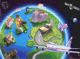
| An example: Planet SABREŞ |
|
|
| The figure depicts an opening screen for Planet SABRE, a new means of presenting to travel agents the functions and data of the American Airlines SABRE Travel Information Network by means of PCs running Microsoft Windows 3.1 and eventually Microsoft Windows 95. |
 |
|
Each of the components described above requires significant time to perfect for any user interface to online services. In many cases, too little time is provided by the project developers. One example in which significant time was provided is the Planet SABREŞ project, a new design of the user interface for American AirlinesŐ SABRE Travel Information Network (STIN), the worldŐs largest private online information and transaction systems. Figure 5 shows a scene from the opening or home screen. The authorŐs firm, in conjunction with the staff of STIN, is developing a new user interface specifically oriented to travel agents. In the limited space available, this article will consider just one aspect, metaphor design
The developers considered for some time how better to represent the core functions of a complex database system for reservations to travel agents. In think-tank sessions, several different metaphorical scenes emerged, e.g., depicting all the primary functions as an airport environment or a cityscape. One approach seemed promising as both novel yet intuitive: the functional modules depicted as three-dimensional objects on the surface of a planet viewed from outer space. Once this Planet SABRE metaphor was determined, the design team tried many styles of depiction (e.g., pictographic, cartoon-like, and representational) for the modules, i.e., application suites for reserving flights, car, and hotels, eventually deciding on representational, intuitive icons.
The large land mass or planet metaphor is useful for depicting elements of an operating system or a suite of applications. In a sense, this image is a very large extension of the concept of the desktop, which is in a room, in a building, in a city, in a country, on a continent, on a world. Notice that some of the items are culturally biased. For example, the postal letterbox representing an electronic mail application makes sense for a user in the USA, but a British user would expect to see a red, columnar British postal box. The design standards actually provide for a variety of icons to be available to represent better items that differ among countries and cultures. In this manner, the user interface design is attempting to make differences not only of language, but of symbolism and illustration suitable for a truly world-wide user group. This diversity in user interface design will eventually need to be considered for most Websites as they become visited by more varied and international groups of users. |
|
|
|
|
|
|
|
With each passing day, more Websites, more sophisticated browsers, and more elaborate Web authoring and designing tools emerge. As with previous developments in technology, these advances do not guarantee good user interface design. There are many opportunities for creative invention of metaphors, mental models, navigation, appearance, and interaction; there are also many opportunities to thwart clear and effective communication. As object-oriented construction of these user interfaces becomes more widespread, designers may be able to develop user interfaces more efficiently and effectively, but the underlying challenge to communicate effectively remains.
Designers must not only give extensive energy to the design of appealing illustrations and opening scenes of Websites, they must grapple with the extensive verbal naming and conceptual organization issues as well, then go on to determine the appropriate similarities and differences of layout, color, lines, textures, illustrations, sounds, and music in user interfaces. Because Websites demand so much effort to build and maintain, the ability of designers to develop a systematic set of user interface elements means that items can be re-used or managed in effective ways without damaging the 'freshness' of Websites and that changes in fundamental design characteristics can be implemented more efficiently because of the systematic nature and inheritance of change that occurs in a large system of signs.
Designers will contribute significantly to the invention of new forms of communication, especially to the means of formulating queries and to displaying results visually. These efforts should be acknowledged, valued, and protected. One way to encourage better design is to take the time to evaluate Websites and to 'prove' in some quantitative manner some significant benefit to implementations. Website design has much to contribute that is new and fresh; on the other hand, Website designers can benefit greatly by learning about lessons from the recent history of the user interface design community. |
|
|
|
|
|
|
|
This article is excerpted and ammended from the chapter "User Interface Issues in Web Design", by Aaron Marcus in the book 'Mastering Web Design', edited by John McCoy, and is reprinted by permission of SYBEX, Inc., ISBN 0-7821-1911-5, Copyright (c) 1996, by SYBEX, Inc. All rights reserved. For further information, please contact <info@sybex.com>."
In preparing this article, the author would like to acknowledge the assistance of the staff and associates of Aaron Marcus and Associates, Inc, and AM+AŐs client, SABRE Travel Information Network, for permission to reprint an image from an ongoing project. |
|